Design company Extra Strong on giving Brian Vernel the flat-pack treatment
Published on Wed 18 Apr 2018THE BRIEF
On receiving the Royal Court’s brief to give Instructions for Correct Assembly actor Brian Vernel the ‘flat pack’ treatment for their print and digital marketing campaign, it seemed straightforward enough.
He would need to appear as a ‘line drawn figure’ doing various every day activities. It would still need to be recognisable as him but he would have to appear ‘assembled’, as if he was a product from a build-it-yourself instruction manual. And for the digital, animated side of this – those parts would need to be seen to move.
It’s not every day you get such a surreal but fun project landing in your inbox so we jumped at the chance to get back to our drawing roots.
THE PROCESS
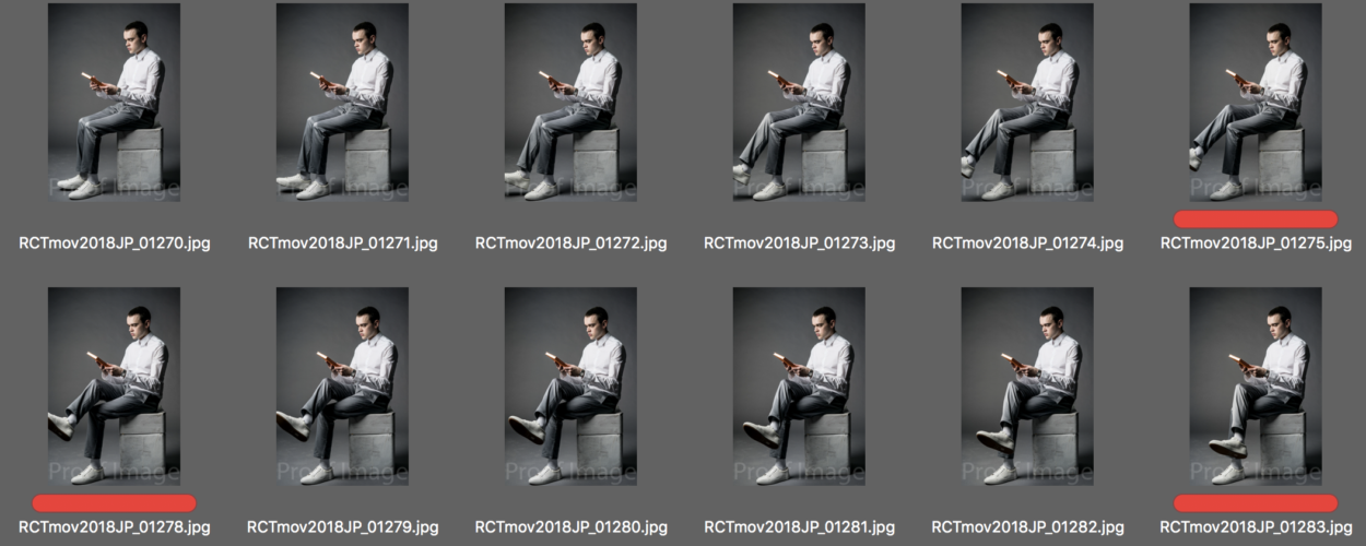
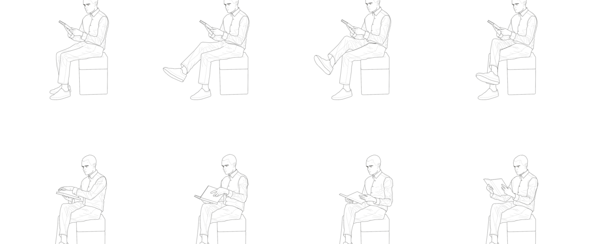
To generate the source imagery necessary for the animations, the Royal Court’s marketing team had done a photo shoot with Brian, capturing thousands of stills of him at a very high shutter speed, in different poses and carrying out different activities.
Together we worked closely on narrowing down the selections of photographs needed to convey each activity. Time and budget constraints meant that we had to limit ourselves to creating each animation from around 5-6 stills max.
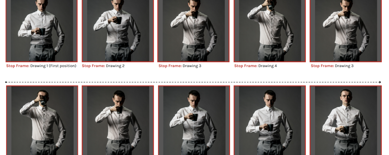
Anyone who’s familiar with creating film or animation will know that most moving image is ideally captured at 25 frames per second to create a smooth, seamless movement. Obviously we wouldn’t have that kind of luxury on this project and the marketing department had rightly chosen to use this to our advantage, suggesting that the look and feel of the campaign (both print and digital) should have a flat-pack/DIY/IKEA style simplicity, which meant that having quite ‘staggered’ stop-frame movement to the animations would fit nicely.
Storyboard/Animatic
With each selection of photos we’d create a rough storyboard confirming the order of the frames and style of animation. We planned to use a mixture of stop-frame animation for Brian’s movements and something referred to as ‘tweening’ for the various body parts being ‘correctly assembled’ at the beginning and end of each animation.
We also created basic animated gifs of each selection using low-resolution versions of the images (in Photoshop), to help confirm if we’d chosen the right stills to adequately convey each movement.
Illustration
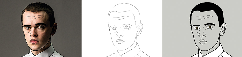
Once we were all happy with the image selection we’d make a start tracing over the images in Adobe Illustrator CC.
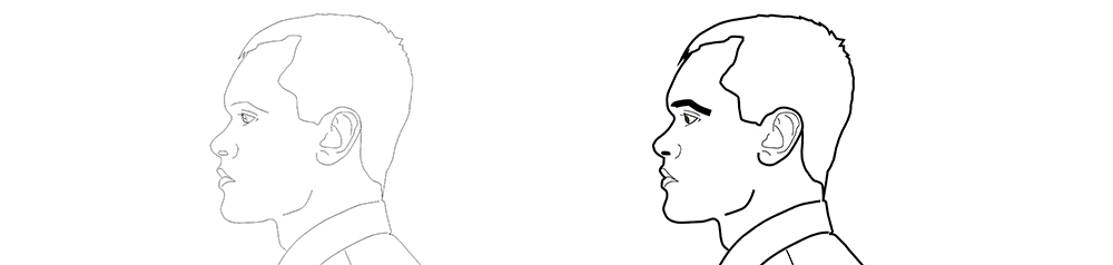
One of the most interesting parts of this job for us was experimenting with how much detail a line-drawing of a real person needed in order to be recognisable. Brian went through some interesting ‘facial surgery’ while we were finding the right balance and some variations of his face looked quite surreal and really didn’t resemble him much!
However, Brian’s quite distinct but strong features (particularly his eyebrows and jaw) actually lent themselves to the process and once we’d settled on a style that worked, making a drawing look like him took minimal detail.
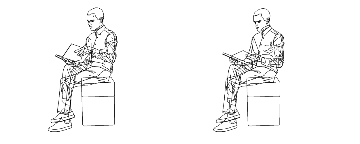
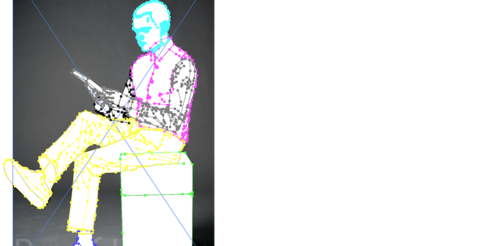
In order to correctly supply the illustrations to our animation department we had to make sure each of Brian’s body parts was on a separate layer. Layers in Adobe Illustrator or Photoshop are just a way of organising artwork and making sure that all the files involved in the creation of the image are easy to navigate (i.e. background at the bottom, foreground in the middle, fine detail on top).
Although this sounds simple enough, it becomes quite complicated when these layers are different parts of the same body and it caused us a few headaches when certain limbs would pass in-front of one another another (Brian’s legs crossing whilst reading the book for example). So this had to be cheated by cropping parts of Brian’s body off [!] in order to create the illusion they were actually on another layer and behind something they really weren’t. As my old boss Marksteen Adamson used to say: “It’s the theatre [of design]”.
Animating
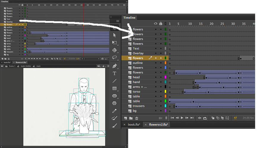
We used Adobe Animate CC to make the illustration move. The software is kind of a cross between what used to be known as Flash and Adobe After Effects.
As you can see from the screen-grabs, although the pieces were short each body part needed its own layer so we had to plan everything very precisely.
Although these visuals make the animation look like the most technical part of the project, the actual drawings of Brian were the most challenging (and time consuming) overall.
The project’s been a pleasure to work on and we’re really pleased with the final results. It’s been very refreshing to create something with so much emphasis on such a fundamental part of our design training/practice. “Getting back to basics” (so to speak).
Best of luck with the show guys!